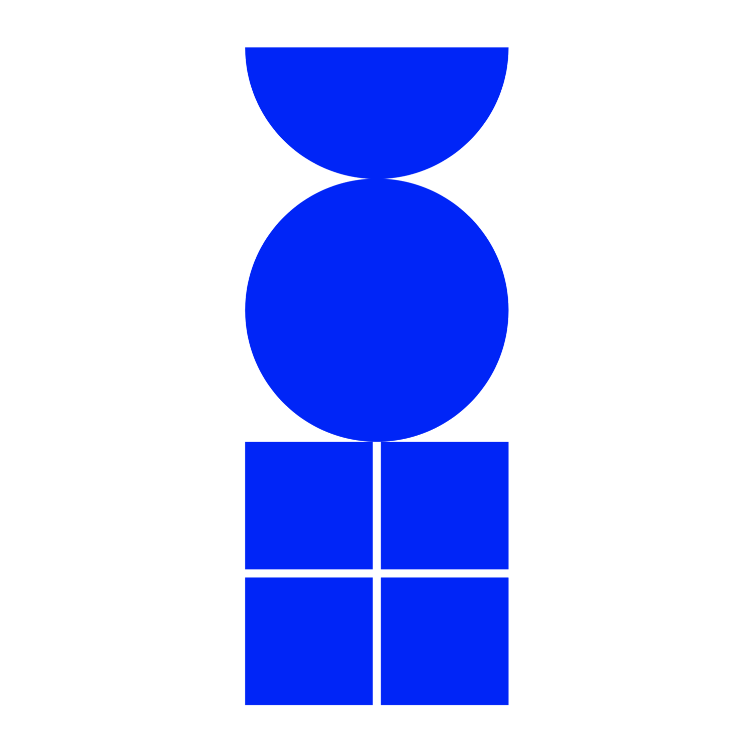
MERCURY’s logo continues its brand transformation by replacing iconic boxed M with puzzle with solution icon.

MERCURY is in the middle of several major platform changes. MERCURY is moving away from its emphasis on “jack-in-a-box” all rounded solutions and curation toward “niche” vertical market solutions.
However, as you likely have noticed, MERCURY has a new logo.

MERCURY started with a simple purpose back in 2018: to provide an all-rounded solution for SME worldwide. We did this by giving people an all-rounded solution - a suite/ box — for their ideas to reach their clients and streamline their operation.
We’re proud to give these solutions to our clients, and grow, connect, and spark new business solutions.
While our mission remains the same, our platform solution and vertical offering are ever-advancing to better serve this mission. As the world changes around us, we aim to create a more deep and thoughtful solution to specific industries and grow together with our clients.
Our updated brand identity is meant to provide a better expression of who we are, where we came from, and where we’re going.
A Brief History of MERCURY’s Logo Progression
2018–2020
Ever since MERCURY first launched in 2018, we started with an infinity logo, which meant “infinity”.
While simple and strong, this “infinity” proved rather inflexible as a logo. It served us well through our first two years, but as MERCURY has grown and evolved, the logo has begun to feel flat, impenetrable, blunt, and not to be toyed with. It is also not particularly distinctive, either.
After exploring about a million different ideas for a new icon, we arrived back at the capital M as a visual mark. From there, we started getting more serious, working with our UX Intern, we pursued the concept that our logo could be made of a box. A logo that builds like a great and memorable conversation.
2020–2021
This led to MERCURY ’s second attempt at a logo. At last, we were on to something! This simple geometric interpretation of the M felt fun - it is a beautifully created box.
2021 - ??
MERCURY announced today that it had updated its brand identity, including a new wordmark and icon:
For the wordmark itself, not much has changed. It felt accessible and gave a nod to our literary roots. Since we’re still the same brand, it didn’t feel appropriate to drastically change — but in the spirit of an ever-evolving MERCURY, we wanted to give it a polish.
We work closely with leading brand designer, Joe Kwan. Joe stated that MERCURY is solving client issues, he felt that MERCURY is like a delightful game or a deeply satisfying puzzle. We couldn’t stop ourselves from playing with all the different treatments, mutations, and color combinations it was practically begging for.
Inspiration and Developments
The symbol Mercury for Mercury in its modern form is derived from the caduceus, or intertwined serpents, which were the main attribute of Mercury/Hermes throughout antiquity. The caduceus was usually shown with at least three loops, but this was simplified to a single loop in the diagram of Kamateros (12th century).
Inspired by the symbol of Mercury, we developed a new logotype system.

Why add a symbol?
A symbol gives us more creative flexibility, another tool in the toolbox. The symbol, like our illustration style, is inspired by language and typography. It is born from the puzzle: that represents an unfinished or impending thought, an idea to come, what’s next. This is, again, what happens on MERCURY — there’s always a new solution.